Design Choices
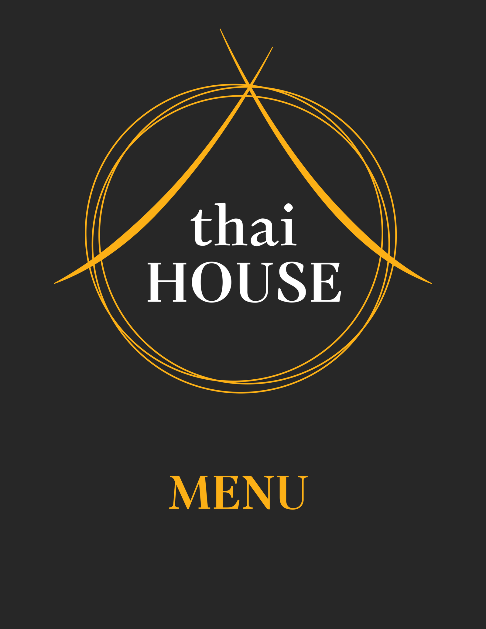
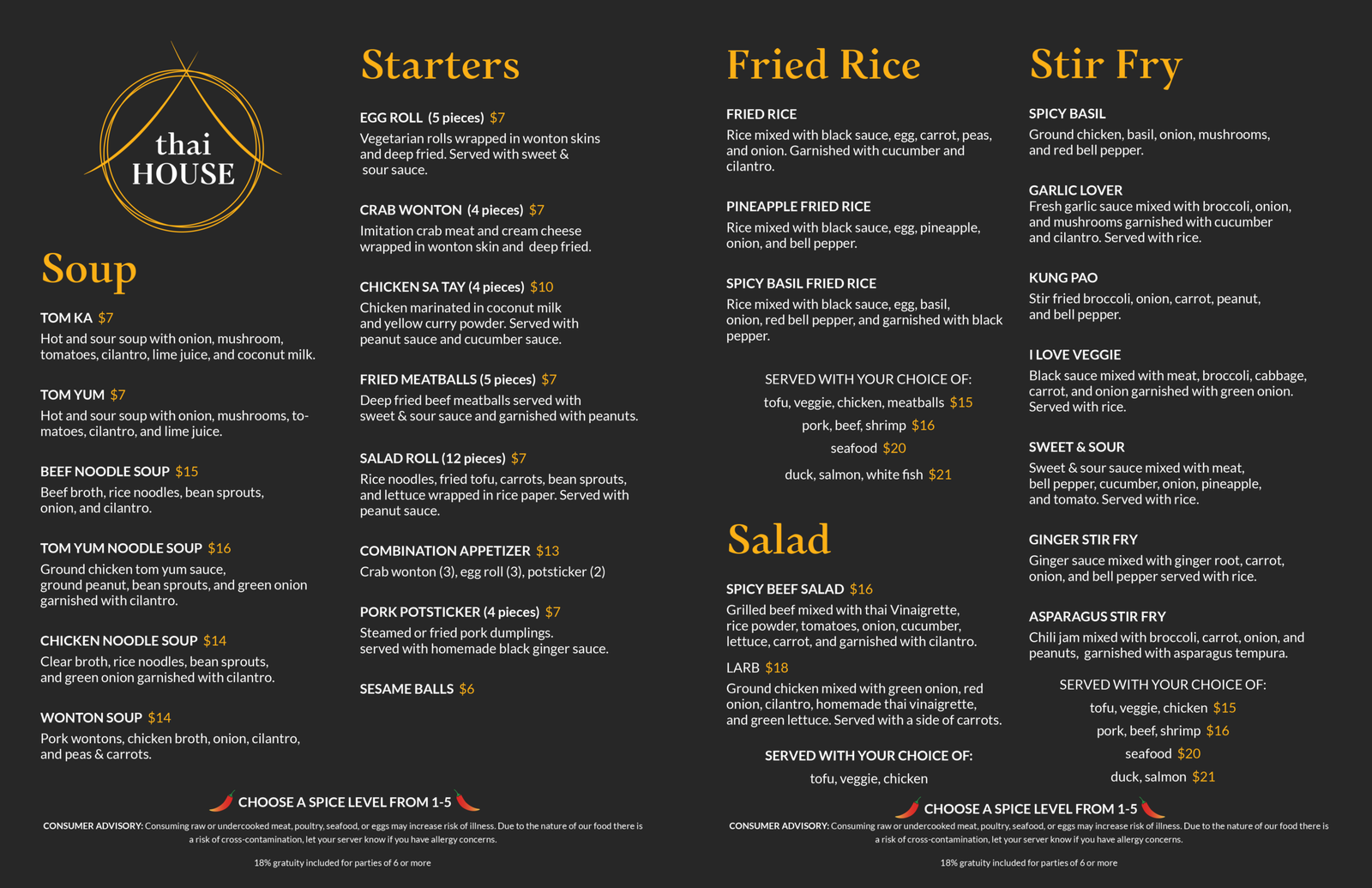
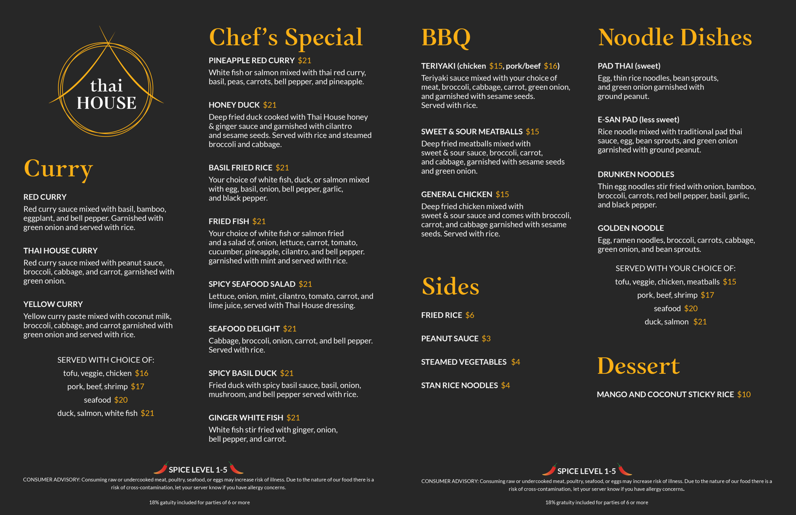
This project is a redesign of the physical menu of an existing restaurant, in addition to its logo. Thai House’s interior is largely black and red, with gold decorations, such as banners and chandeliers. The menu redesign evokes a fine-dining feel, with black and gold as the main colors. All photography from their current menu was eliminated, as it made it feel more like a food court or a casual dining experience. References to Thai noodle dishes, chopsticks, and the peaked roofs of wood-framed buildings are found in the logo, by the use of offset thin circular outlines, and two shapes intersecting at the top to create an apex. Monomakh, a curvilinear serif with angular “dots ” on the lowercase “I”, was used for the heading typeface to mirror the peaked shape of the logo. A round sans-serif typeface (Lato) is used for the subheadings and text to contrast the headings and create a clear type hierarchy.